When we brought back the roadmap in September, we asked what you wanted to see next. A UI refresh quickly shot up to become one of your top 3 most-requested items. It’s been holding steady ever since.

The message was clear. You didn’t need us reinventing the wheel or moving things around. You needed a dashboard that’s easier on the eyes when you’re managing dozens of sites all day. Better contrast. The familiar feel of WordPress admin (dark sidebar and navigation with a light work area). And best of all, the same layout you know, just more comfortable to use.
Today, phase one is ready. Early Access members will see the visual refresh immediately when they log in. For everyone else, joining Early Access takes just seconds. And yes, we’re already working on your other top requests.
What’s Actually Changed?
For this first phase, we decided to focus on three main areas. We made these choices based on your feedback and what’s happening across the industry. The aim was simple: to make the dashboard more accessible, easier to read, and more comfortable for everyday use, especially if you’re managing a lot of sites.
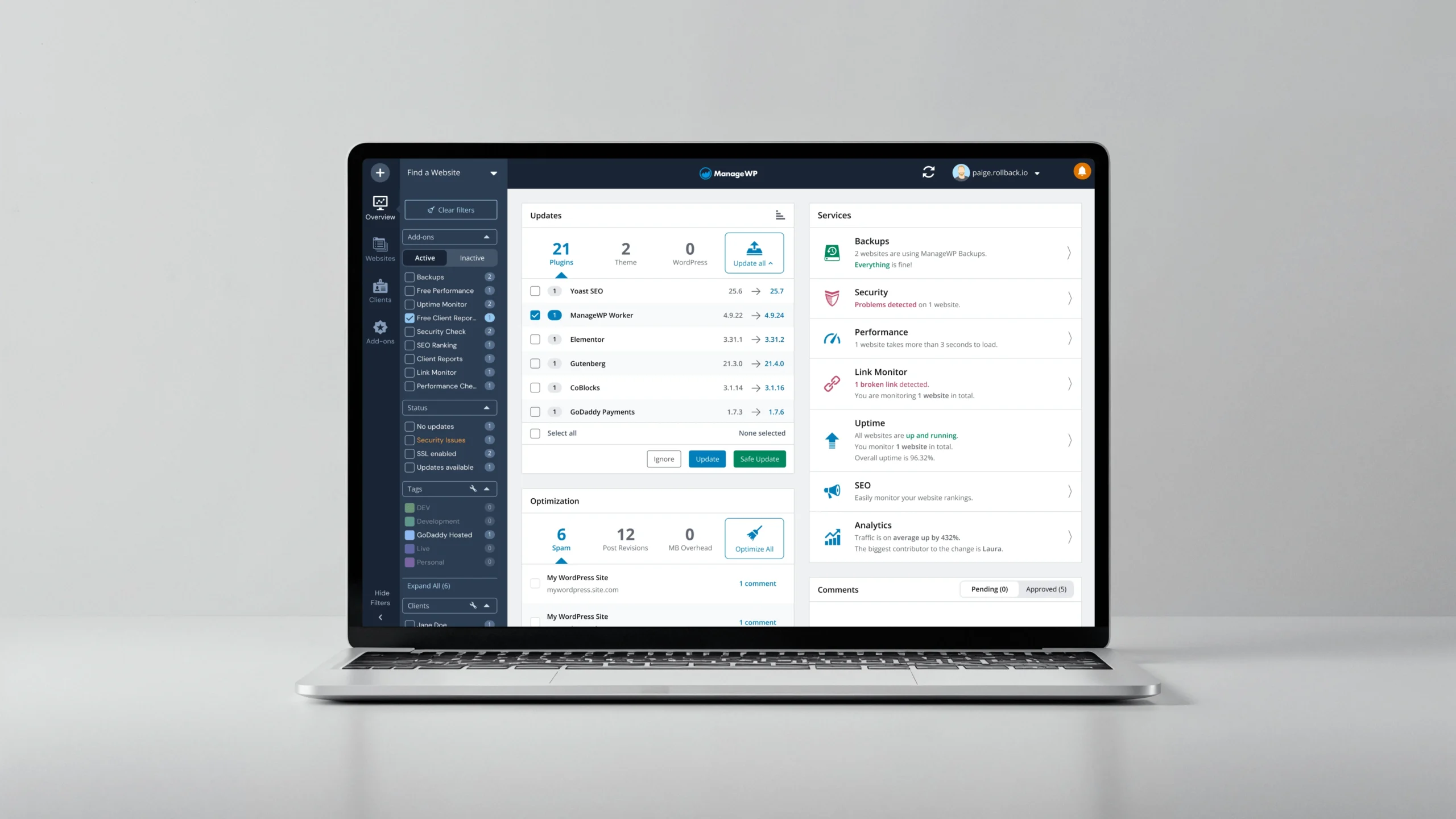
The Familiar Connections
Let’s start with the elephant in the room: the sidebar and navigation are now dark, just like WordPress admin. This creates that familiar separation between where you navigate and where you work. And before you panic about having to relearn everything, we kept the layout exactly the same. All that muscle memory you’ve built up? Still works.
If you use Slack daily (and who doesn’t?), you’ll feel right at home. The dark sidebar gives off those same vibes, and the clean separation between navigation and content just makes sense. It’s a pattern millions of us already know and love, which means less cognitive load when switching between tools.

Plus, we’ve extended this dark theme to a few more elements so that when you jump between WordPress admin, Slack and ManageWP, your brain doesn’t have to adjust to a whole different visual language. It just feels… familiar.
The Visual Accessibility
We’ve completely overhauled the color palette. Instead of what felt like fifty shades of grey that nobody could distinguish, we now have a unified system with contrast ratios that meet WCAG 2.2 standards. As a result, everything’s more readable across the dashboard.
For instance, your tags still use the colors you know (we see you, color-coding enthusiasts), but we’ve cranked up the contrast so you can actually read them without leaning into your screen. Alerts are now impossible to miss. When something needs your attention, you’ll see it immediately. No more pale warnings that fade into the background.
Hours into your workday, you’ll notice the difference with these changes. Less squinting, less fatigue, more focus on what matters. In fact, when Anne-Mieke Bovelett visited our office a few months ago to educate our team about accessibility, she reminded us that progress beats perfection and that “taking it step by step is fine!” Thanks to her guidance, we knew what our first step needed to be. What comes next? Which accessibility improvements do we tackle in phase two? That depends on you and your feedback.

The Little Things That Add Up
We made dozens of small refinements that work together to improve your experience. Here’s what we tackled:
Consistency touches: updated logo, unified dark theme across all UI elements from dropdowns to notifications. Everything feels like it belongs together now.
Noise reduction: streamlined the color palette, removed unnecessary variations. Ultimately, less visual clutter means less cognitive load.
Polish details: refined hover states, smoother transitions, better spacing. The kind of improvements you might not consciously notice but definitely feel.
Sure, none of these changes are revolutionary on their own. But together? They create a dashboard that just feels better to use.
Try It Today in Early Access
If you’re in Early Access, you already have it. The new look is live in your dashboard right now. (Lucky you!)
Not in Early Access yet? Come join us. Takes literally 10 seconds:
- Click your account dropdown
- Select “Early Access”
- Hit “Sign up”
And that’s it. Then refresh your dashboard and boom—new look.
Early Access is where we test everything first. From now on, everything new follows this same path. We build it. Early Access members get it first. We work on your feedback. Then release it to everyone.
The new look today, then Patchstack integration tomorrow (okay, not literally tomorrow, but soon). It’s free, you keep all your existing features, get access to those we build next, and participate in shaping the future of ManageWP as much or as little as you want. No pressure. 🙂
Leave a Reply